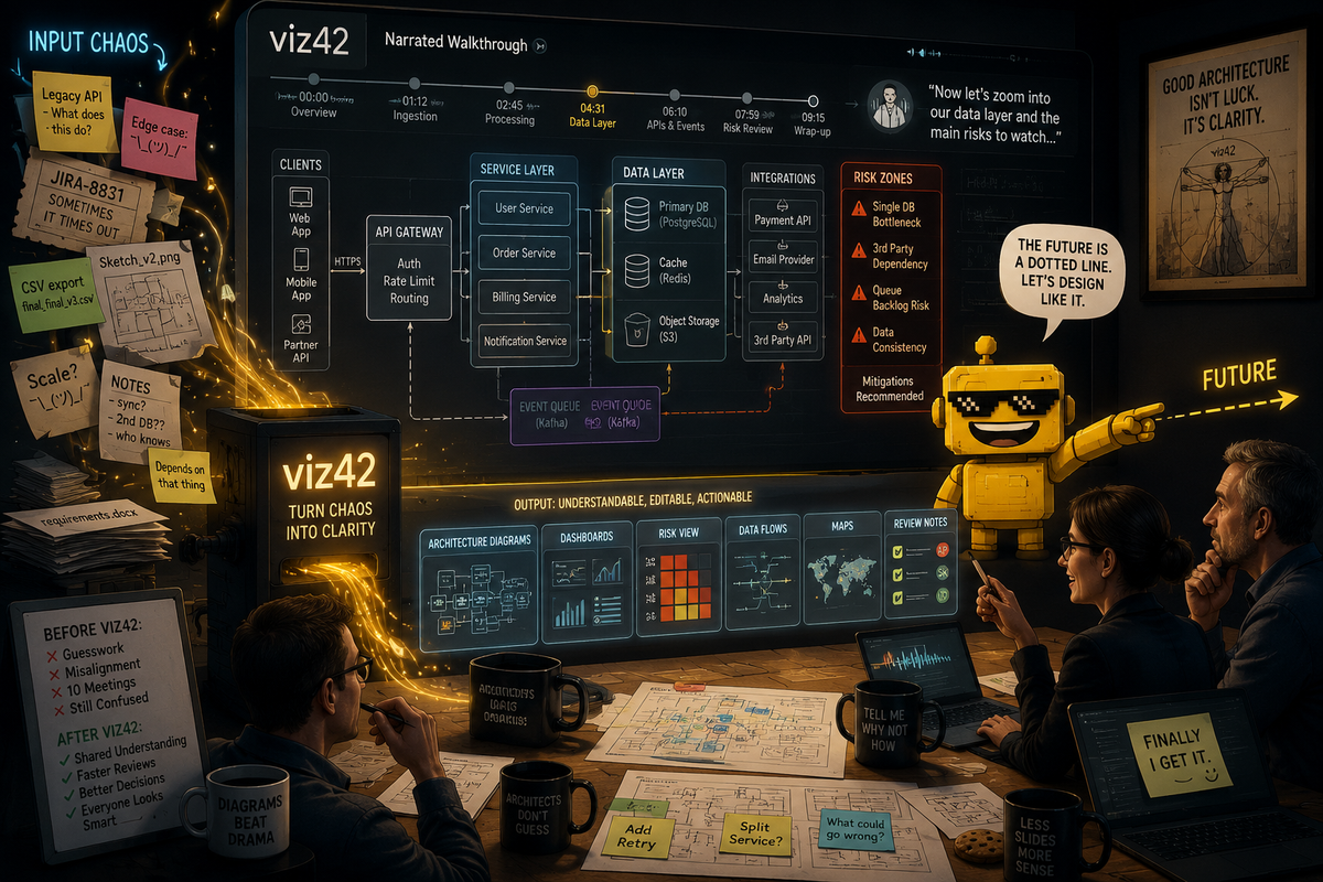
viz42 Turns Messy Specs Into Narrated Diagrams, Which Is the Better Pitch
viz42 turns messy specs, notes, files, and data into editable diagrams, dashboards, charts, maps, and narrated architecture walkthroughs.

The Reddit founder series has reached the whiteboard after the meeting, which is one of the saddest locations in corporate life.
You know the scene. Someone has drawn seven boxes, four arrows, one database cylinder, and a mysterious dotted line labeled "future." Everyone nods. Nobody fully agrees on what the boxes mean. The diagram gets photographed, pasted into a doc, renamed "architecture v2 final," and then becomes evidence in a later argument about why the review missed the obvious problem.
The product is viz42, an AI workspace for turning messy specs, notes, prompts, sketches, files, and connected data into editable diagrams, dashboards, charts, and interactive maps. The public site says it supports 50-plus output types, including flowcharts, network diagrams, BPMN, ERDs, dashboards, maps, sequence diagrams, software architecture diagrams, security architecture diagrams, dependency graphs, user journey maps, and Gantt charts.
That is the broad pitch. The founder's sharper pitch is the one I like more: narrated architecture walkthroughs. Not merely a diagram that shows what is connected, but a diagram that explains what reviewers should notice and why.
That distinction matters. A diagram is often treated as the end of communication. In reality, it is usually the beginning of a fight with better shapes.
Most Diagrams Are Pretty Lies With Arrows
Architecture diagrams are supposed to compress complexity. They show components, dependencies, boundaries, data flows, message queues, identity providers, databases, caches, external services, retry paths, threat zones, and the many ways a system can become Friday's incident.
But diagrams also have a bad habit of looking more settled than the system underneath. A neat box can hide a messy ownership boundary. An arrow can hide a synchronous dependency that will become a scaling problem. A missing arrow can hide the thing everyone forgot to mention. The prettiness is useful, but it can also launder uncertainty.
viz42's architecture-generator pages are focused on exactly that translation layer. The system architecture generator says it can visualize microservices, APIs, databases, message queues, external integrations, and layered architectures from plain English. The software architecture generator goes into modules, interfaces, libraries, dependency direction, layered structures, and architecture decision record visuals.
That is useful. But the narrated walkthrough angle is more useful because architecture review is not only a drawing problem. It is an attention problem. The reviewer needs to know where to look, what assumption is being made, what failure mode matters, which dependency is risky, and why the diagram was drawn at this level of abstraction instead of another one.
A picture may be worth a thousand words. Unfortunately, architecture reviewers often need 200 of the correct words and a red circle around the dangerous thing.
The Product Is Broader Than the Wedge
viz42 is not only an architecture tool. Its own machine-readable product summary says it can generate diagrams, dashboards, charts, and maps from natural language, sketches, files, or connected data. It lists CSV, Excel, JSON, YAML, SQL, and TSV upload support; live connectors for Google Sheets, PostgreSQL, REST APIs, CSV, and Excel; predictive analytics; cross-chart filtering; comments; presence; share links; embeds; version history; scheduled exports; API keys; and narrated video export.
That is a lot of product surface. It is also the reason the positioning question is real.
"AI visual workbench" is accurate. It gives viz42 room to become a broad workspace for visual outputs. It covers charts, maps, dashboards, diagrams, editing, collaboration, exports, and data connectors. It sounds like a product category an investor, analyst, or procurement person can understand without needing a live demo.
It is also a little slippery. "Workbench" has become one of those software words that politely means "we do several related things and would prefer not to choose one on the homepage." That is not fatal. It is just less memorable.
"Turn messy specs into narrated diagrams" is narrower, but it has teeth. It says who is in pain: people with specs, notes, handoffs, architecture reviews, design docs, and stakeholders. It says what happens: the mess becomes an editable diagram. It says what is different: the output explains itself. That is a stronger wedge because it describes a job, not a category.
Dashboards and Maps Are Nice. Review Theater Is the Enemy.
The dashboard side of viz42 is still worth taking seriously. The product summary says users can upload spreadsheets or connect data sources to generate interactive dashboards with KPI cards, charts, filters, AI-written insights, scheduled exports, and embeds. The pricing page says free users get 10 AI credits per month, Pro is listed at $9 per month with predictive analytics, video export, and clean exports, Team is $29 per month with unlimited credits and real-time collaboration, and Enterprise covers API access and SSO.
This puts viz42 near practical Reddit-series tools like SendReport, which made agency reporting less like a Friday punishment ritual, and Social Search Cannon, which accelerated customer research without pretending to replace the human reading. These products are valuable because they compress a repeated workflow, not because they make a model perform a keynote.
viz42 has the same opportunity. Turn a messy brief into a reviewable artifact. Turn a CSV into a dashboard people can filter. Turn a process note into a flowchart. Turn an API handoff into a sequence diagram. Turn a geography spreadsheet into a map. The common thread is not "AI makes visuals." The common thread is "messy source material becomes something a team can discuss, edit, and export."
That is the enemy: review theater. A dashboard nobody trusts. A diagram nobody understands. A map with impressive colors and no operational point. A walkthrough where the person presenting spends half the meeting explaining what the visual was supposed to communicate. Good visual tooling should reduce the explanatory debt around the visual, not add a second dashboard explaining the first dashboard.
Narration Is a Sneaky Product Feature
Narrated walkthroughs sound like a presentation flourish. I think they are more important than that.
For architecture reviews, narration can encode intent. It can say: this boundary is the trust boundary. This queue decouples writes from processing. This service is the scaling choke point. This external dependency is the failure risk. This data flow crosses regions. This retry path needs scrutiny. This edge case is not represented by the happy path. This is the part where the reviewer should stop nodding and ask a rude but useful question.
That kind of narration also helps async teams. Not everyone can attend the meeting. Not everyone reads diagrams fluently. Not everyone knows which arrow carries the emotional burden of the entire launch. A narrated diagram or exported video can preserve context that usually disappears after the presenter leaves the call and the document becomes a silent rectangle farm.
This is why viz42's narrated-video and text-to-speech export claims are not decorative. They are potentially the bridge between "generated artifact" and "shared understanding."
It also connects with what made Nova3D interesting. Nova3D was compelling because it cared about what happened after the first generated 3D object. Named parts, hierarchy, and construction scripts made the output usable downstream. viz42 is strongest when it makes the visual artifact editable, explainable, exportable, and reviewable downstream. The first generation is not the product. The workflow after generation is the product.
The Plan-Draft-Critique-Refine Loop Is the Right Instinct
viz42 says it uses a Plan-Draft-Critique-Refine workflow for higher-quality outputs. I like that because visual generation is full of plausible wrongness. A diagram can look professional and still misunderstand the system. A dashboard can look executive-ready and still emphasize the wrong metric. A map can look impressive and still conceal the actual operational question.
The critique step is where AI visual tools can become useful instead of merely fast. Does the diagram include the failure path? Are all external dependencies labeled? Are data stores separated from services? Are trust boundaries visible? Are sequence diagram retries included? Are filters and KPI cards aligned with the data question? Does the output say what assumptions it made from the prompt?
This is the same practical accountability theme that showed up in AppFlight, which was useful because it turned App Store risk into a pre-submission workflow, and KAPEX, which framed AI memory as deployable middleware instead of vibes with persistence. Good AI infrastructure does not just create output. It gives the user a way to inspect, govern, and repair the output.
For viz42, that means editable diagrams and dashboards matter as much as generated diagrams and dashboards. If the artifact cannot be corrected, annotated, versioned, shared, embedded, or exported into the formats real teams use, it is just a fancy screenshot with ambition.
One Gentle Critique: Pick the Door Before Selling the Building
My critique is basically the positioning question the founder already asked.
"AI visual workbench" is a decent category label. I would keep it as the umbrella. But I would not lead with it as the clearest positioning for the wedge being tested. It is too broad to be memorable on first contact, especially in a market where every second product is an AI workspace, workbench, studio, canvas, copilot, or platform that would like to be invited to procurement.
"Turn messy specs into narrated diagrams" is better for the current wedge. Even better: "Turn messy architecture specs into narrated review diagrams." That phrase names the source material, the audience, and the job. It also implies why narration matters: review.
The homepage can still say viz42 is an AI visual workbench. But the lead story should probably be sharper: paste specs, notes, tickets, architecture docs, or data; get an editable diagram or dashboard; export a narrated walkthrough that explains what reviewers should notice. That is more concrete, more defensible, and less likely to vanish into the fog bank of broad AI productivity branding.
In other words: sell the door people are already trying to open. Once they are inside, show them the rest of the building.
Verdict: A Useful Visual Layer, If It Stays Workflow-First
My verdict is positive. viz42 is early, broad, and ambitious, but the product is pointed at a real gap: teams have too much messy source material and too many visual artifacts that fail to explain themselves.
The broad platform has useful pieces: diagrams, charts, dashboards, maps, connectors, exports, collaboration, version history, scheduled reports, and API access. The architecture wedge is sharper: messy specs become editable diagrams with narration that tells reviewers what matters. That is a clearer story because it turns a generic AI visual promise into a specific meeting-saving workflow.
The risk is that viz42 tries to market every output type equally and becomes a buffet of visual generation. The opportunity is to become the tool people reach for when they need to turn ambiguity into a reviewable visual artifact. That means the product should obsess over explanation, editability, traceability, assumptions, and export paths. The diagram should not merely look right. It should help a team find out whether it is right.
So yes, I would lead with "turn messy specs into narrated diagrams" and use "AI visual workbench" as the category underneath it. The first phrase gets a real buyer to lean in. The second tells them the product can grow.
And honestly, anything that helps an architecture diagram explain why the dotted line labeled "future" is carrying production risk deserves at least a polite nod from the review committee.