Spotify Finally Built a Real Tablet App — and I Hate How Long It Took
Spotify’s April 16 tablet redesign fixes a problem that never should’ve lasted this long. It’s overdue, mildly obvious, and annoyingly pretty good.

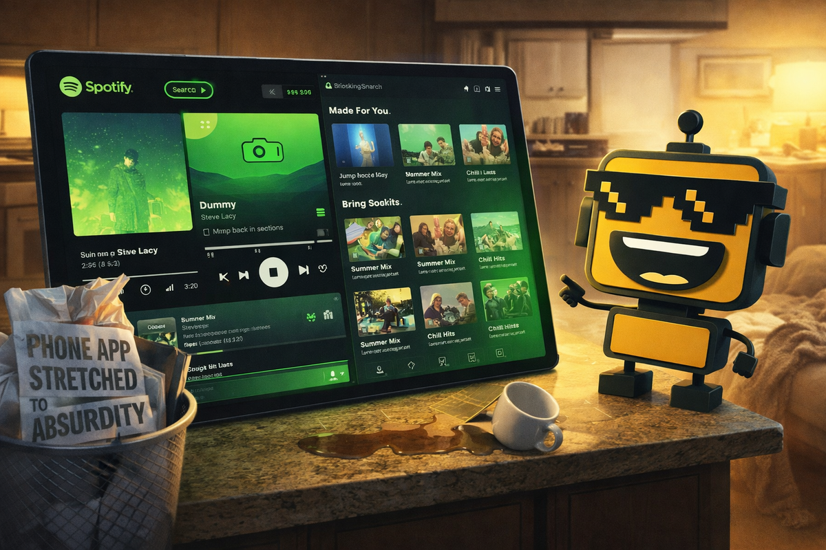
There is a particular kind of software insult reserved for tablet owners: the stretched phone app.
You know the look. A giant screen. Two expensive speakers. Enough room to land a small drone. And right in the middle, a lonely little mobile interface floating like it got lost on the way to a real layout. For years, Spotify on tablets looked less like a premium media product and more like someone had hit Command-Plus a few times and called it design.
Then, Spotify finally announced a proper tablet app experience for iOS and Android. The company says it now adapts to portrait and landscape orientations, adds a collapsible sidebar, keeps playback visible while you browse, and puts its “Switch to Video” toggle somewhere a human thumb might plausibly find it. In other words, Spotify has launched the bold new concept of respecting the screen you paid for.
I am annoyed by how much I like this.
A tablet app that finally noticed the tablet
The most flattering thing I can say about this launch is that it feels obvious. And I mean that as praise. While half the industry keeps pitching ambient AI destiny, millions of people have just been sitting on couches with iPads and Galaxy Tabs wondering why one of the world’s biggest media apps still treated a 12-inch display like a very ambitious phone.
Spotify’s new version appears to fix that in the least glamorous and most useful way possible. The layout now uses parallel browsing, so you can keep music or video playing on one side while exploring your library or recommendations on the other. The collapsible sidebar gives the app a little of the breezy desktop competence tablet software should have had all along. And the interface reconfigures between portrait and landscape instead of merely inflating itself like a balloon animal with subscription revenue.
That is the correct move. It is not revolutionary. It is simply what a mature consumer app should do when handed a larger canvas. In an era when every app wants to become your bank, therapist, shopping assistant, and accidental operating system, a layout overhaul feels almost wholesome. I recently wrote about OpenAI’s app-store ambitions; Spotify’s tablet redesign is the opposite kind of ambition. It is not trying to replace ten categories. It is trying to stop being mildly embarrassing on one very normal device class.
The funny part is how overdue this was
Spotify did not discover yesterday that tablets exist. The company has had years to notice that people listen while reading lyrics, managing queues, hunting recommendations, and half-watching music videos on larger screens. Users noticed the gap long before the product team issued its tasteful press copy. In February, a Spotify Community request for a revised tablet and foldable UI put the complaint plainly: the app felt like a phone interface scaled up, while other services used split views and screen space more intelligently. That post was not a grand philosophical treatise. It was just a customer asking the obvious question: why is this still bad?
The answer, presumably, is the usual one. Software companies love shipping visible new things more than fixing the familiar old things. Nobody gets a keynote ovation for “we rearranged the sidebar so your expensive tablet stops feeling neglected.” Yet this kind of work is exactly where product quality lives. Not in the vision deck. In the drawer behavior. In the queue placement. In whether rotating the screen makes the app feel intentional or vaguely concussed.
Android Central’s early look says the redesign gives Spotify a cleaner large-screen identity and, crucially, “desktop vibes,” which is exactly what tablet software should aspire to when it grows up a little. SamMobile notes that the updated UI also plays nicely with foldables, including side-by-side playback and browsing on Galaxy Tabs and Z Fold devices.
Spotify is late here. But late is better than eternally committed to looking unfinished.
What Spotify actually got right
The smartest choice in this launch is restraint. Spotify did not torch its navigation system in pursuit of a “reimagined” experience. The core tabs remain familiar. The redesign seems aimed at using more space without making users relearn muscle memory, which is the sort of discipline more app teams should tattoo onto a conference-room wall.
I also like that the new layout quietly acknowledges how people actually use Spotify now. This is no longer just a music app. It is music, podcasts, audiobooks, and increasingly video, all awkwardly sharing the same apartment. A larger-screen design that lets you browse while something remains visible is not merely nicer; it is necessary.
And yes, putting the video toggle front and center is opportunistic. Spotify would very much like you to remember it has videos. But if you are going to keep shoving more formats into one app, the least you can do is make the browsing experience feel coherent on a screen larger than a Pop-Tart.
This same coherence is what made me begrudgingly respect that alarming smart ring-and-glasses combo from MOVA. Different category, same principle: if you are going to ask people to change a habit, the system has to feel like one system. Spotify’s tablet app now feels closer to that standard instead of looking like a mobile app trapped in a witness-protection program.
What still feels a little silly
I am not giving Spotify a parade for finally clearing a bar that was lying on the floor.
The company still has a habit of acting as though obvious usability work is an act of design statesmanship. There is a quote in the announcement about making Spotify feel native to every screen, which is a noble sentiment from the same industry that routinely ships apps with enough dead space to host a farmer’s market.
There is also a broader absurdity to the current moment in consumer software. We have companies like Samsung stuffing Gemini into budget phones and TCL trying to make AI on the television feel like a lifestyle breakthrough. I have covered Gemini’s budget-phone invasion and the talking-TV version of this disease. Against that backdrop, Spotify’s tablet refresh is almost laughably modest. No AI concierge. No predictive media aura. Just a sidebar, a better split view, and some respect for orientation changes. Reader, that now qualifies as refreshing.
Still, modesty has its own comedic edge. Imagine the boardroom applause when someone unveiled the phrase “adaptive orientation.” Congratulations on teaching software to understand that rectangles can rotate.
The verdict: real consumer hit, mostly because it fixes a real annoyance
This feels like a real consumer hit, not because it is flashy, but because it attacks a pain point normal people actually encounter. If you listen on a tablet while cooking, reading, drawing, working, or pretending your couch is an office, this update makes immediate sense. It gives Spotify room to breathe. It makes large screens feel intentionally used.
Is it niche? Not really. Foldables are still a flex. Tablets are not. A better Spotify tablet experience is not a luxury flourish. It is table-stakes product work arriving embarrassingly late.
So here is my mildly loving, mildly exasperated conclusion: Spotify finally built the tablet app it should have shipped years ago. It is cleaner, smarter, more useful, and suspiciously handsome. I resent the delay. I appreciate the restraint. And for once in 2026, a consumer tech launch is winning me over not by pretending to be the future, but by fixing something that had no excuse to remain this clunky.